Sunny Side is an app that provides users with easier access to viewing the menu and additional nutritional information about the food and snacks offered at the Sunny Side poolside snack shop.
This project was created in Figma for the Google UX Design course.
My responsibilities included conducting user research and interviews, paper and digital wireframing, low and high-fidelity prototyping, conducting usability studies, accounting for accessibility, and iterating on designs.
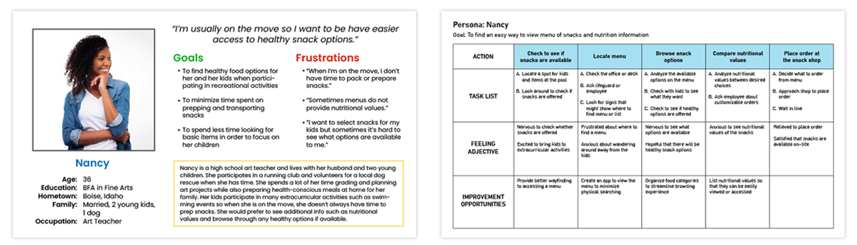
The target audience was focused on busy individuals and families who want an easier way to find snacks that can also provide nutritional information. Personas and user journey maps were crafted to focus on the needs of this audience.
Key challenges I discovered through research were that menus were not easily accessible or visible, there was a lack of sufficient nutritional info available, and the food options were not immediately clear to the user.
Starting the Design
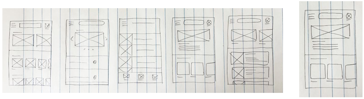
My process for the paper wireframes stage involved consideration for food categories and features such as a daily special. After utilizing the Crazy Eights exercise, I began to hone in on ideas and specific features I would like to take further into the next phase.
After constructing the digital wireframes, I created a low-fidelity prototype of the various screens involved in the user flow.
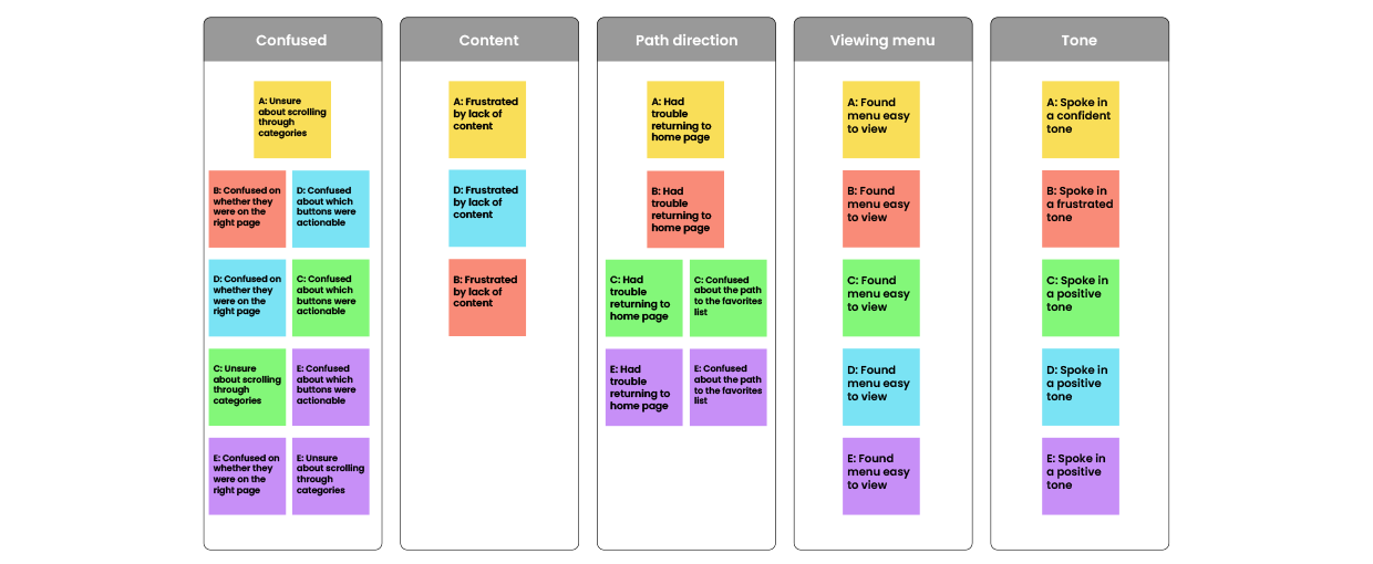
After studying the usability study findings, the information was assembled into an affinity diagram.
Themes discovered through research included: unclear return path to the homepage, unclear active call-to-action buttons, and confusing category navigation.
From there I derived insights that included smoother page flow, clearer button cues, and improved category organization.
Refining the Design
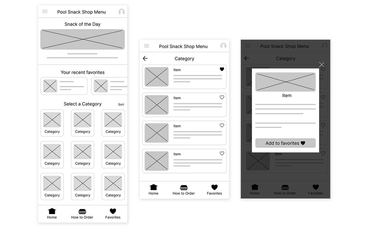
As I began the high-fidelity mockups, I honed in on the visual details of the app. I wanted to bring emphasis to the logo by using consistent branding.
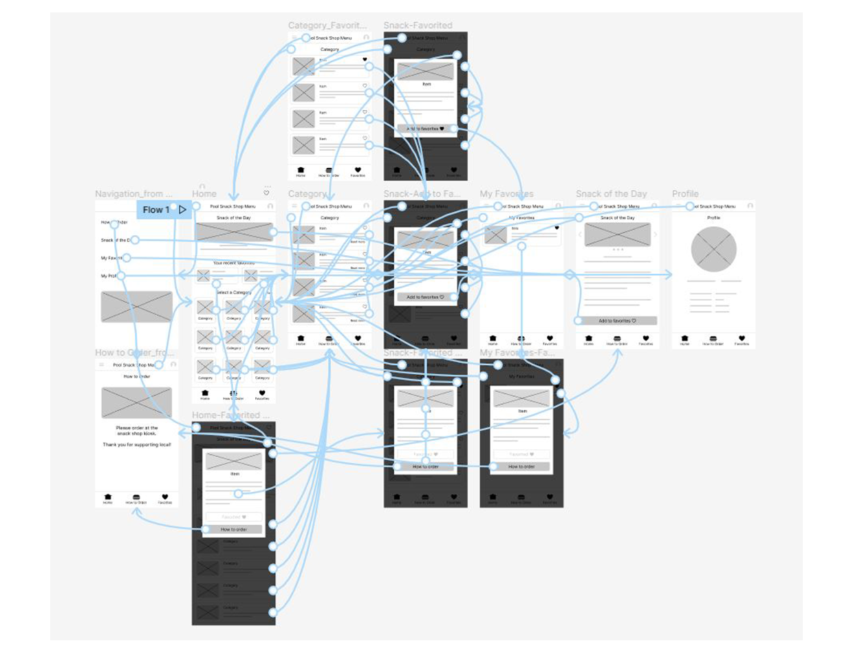
Through iterations, I found that a static bar placed at the bottom of the screen allowed for ease of navigation to and from important screens of the user journey.
Going Forward
What I learned through this project was that aside from a dedicated view of the menu, providing users with additional features such as a favorites list and allowing for different paths to arrive at the same destination gave them time and resources to find what they were looking for. I learned that accessibility affects the design and should be taken into account every step of the way.
The next steps I would take:
Further research into what additional information users would like to see that would be helpful in enriching the user experience.
Enhancing the setting features would allow for greater accessibility.
A search feature could be implemented so that the users can have an alternate path to accessing the menu.